Friday, March 30, 2012

Creative Chemistry -Day 9

I am sorry you can't see the beauty of the Perfect Pearls on this and the following tags. I promise to take Better photos soon ( a relative term).
This effect is achieved by making piles of Perfect Pearls and pools of Distress ink on your craft sheet and layering them on.
A keeper.


Below left is PP mists layered on to tag and right is applying the PP to wet stamped images stamped with Distress and it guilds the image. I'll be using this technique for sure.


Comments and questions welcomed!
To read what is on my heart please visit Still Water Refuge. Prayer requests always welcome.

Creative Chemistry -Day 8

This technique (and the Perfect Pearl Piles-see next post) are worth the price of this class.
The scan does not do them justice. when I have time(!?) and use this in the future I will get a better photo.
I love how the crackle paint looks like leaf veins and now I'm getting the use of the stains.


 These two tags illustrate the techniques- hey- I did the homework.
I like to show off my "mistakes".
I'll keep at it, and I want you to also.
Yesterday a friend shared she took a silk painting class and the teacher was so accomplished what she took home from the class was she couldn't ever be good enough to paint silk, and it took her almost ten years to try.
T!m and I both want you to just do it! Have fun, play, get inky.


To the right, is an acrylic paint resist- you can see the lovely flourish I did in snowcap and not the lovely gingko in metallic.
It's just a sample. More experimentation needed with sticky back canvas to get the paint flowing.


Thanks for all your kind words and comments.

Watch this space for the new Spring Quietfire Design Rubber coming soon.

To read what is on my heart, please visit Still Waters Refuge. Prayer requests always welcome.

Tuesday, March 27, 2012

Creative Chemistry -Day 7

No fun on day 6, no Distress Markers. I just heard mine on order might be in on Wednesday. Fingers Crossed.


Today we played with embossing powders.
To the left we embossed and inked over with distress and I sprayed and flicked.
Stamps by Quietfire


Below Right I did the same as above and then ironed off the embossing powder on the surface. More of a matte effect. Hard to see here. Enough plastic stays in the paper that it still acts as a resist.


Here we have a rusted look by doing everything you shouldn't do when you emboss. After you put on the powder flick and rub some off. I think I should have taken off more for more room for the ink to penetrate.


I didn't do the distress emboss tag as I don't have any distress emboss powder and for some reason I don't feel I need any. It's a happy feeling!


Comments and questions always welcome.

Friday, March 23, 2012

Creative Chemistry -Day 5

I'm just learning to get comfortable with these Distress Stains. You can't see here that the Pickett Fence has pigment in it, so it has a shine that makes it pop out of the dye inks.
Layered stains with stamped Pickett Fence and oilbased ink focal image.
Stamps by Natures Print Shop . Thanks Bibi


These layers are made by puddling the stain on the craft sheet. The Pickett Fence helps it to marble.
Same stamp so you can see how the techniques give different effects.

Comments and questions welcomed.

Creative Chemistry -Day 4

Watercolor painting with re-inkers. I  never used this stamp and it has been longing to be colored.
 They say the Great Masters only three colors, {T!m had 36 in his pallette} I only had 3 reinkers, so I cheated and used some of my pads, tho mostly I stuck to the technique. I might use watercolor paper next time.
I enjoy using  waterpens and craft sheet is my favorite pallette and it enables you to create the back( see below left)

The Back -I'm having fun using the back of the technique tags to clean up the craft sheet!


Layered Misting- I  like a bit more control. I used an architectural template as a stencil, the spry leaked and I like the effect. I might spend some time exploring this technique.


Thanks for all your comments- always welcome- I  acknowledge all if they come through with a return address.

Wednesday, March 21, 2012

Creative Chemistry -Day 3

I learned two very interesting things today. On this tag to the left, the top stamp is the pad tapped on the rubber- clear crisp image.
The stamp below is the pad rubbed on the stamp- a 'second generation' image, without inking and having to stamp off some of the ink.

What I didn't learn- if oil and water don't mix, why does putting oil based ink act as a primer for water based ink on rubber?

The second was in spite of the class. I was having issues with my printer only wanting to print in black and Sir Google suggested I soak the ink jets in hot water. Messy and it worked!


To the left Alcohol Ink agates. Stamps by Quietfire


Below Archival ( I used Versafine) Resist. the technique is using oil based inks


To the right is printing with embossing folders with oil based ink that acts as a resist so you can colorize over with water based ink.
Please keep in mind this is mostly a technique class and I'm not trying to pretty up the tags.
They have notes and instructions on the back as well.


Comments and questions welcomed.


Tuesday, March 20, 2012

Creative Chemistry -Day 2

 I could use a less creative and a little more chemistry.

And I'm enjoying T!m telling his story and taking time to make tags to use as teaching adds and quick reference.
I've never been a big tag fan, and a have a life time supply of manila folders so they are turning into fun note takers.
The tags will be stored on a ring binder for easy access.

This tag at left demos various ink applications on to manila tag, and some random notes on dye inks. I've used the back as well.


These, below, are stamps inked with Distress, misted and stamped .
 on the left stamped on watercolor paper
and on the right stamped directly on the tag.


These are wrinkle free Distress- lots of ink on the craft sheet, spritz and dab and dry till you are done.
More to come-comments welcomed.

Friday, March 16, 2012

Knitting the Sweater You Want from the Yarn You Have

Here is the project sheet and a small piece of the yarn.
The pattern is my own body .
The yarn is the Pantone color of the year- Tangerine Tango- and I've had the yarn since the 60's.
I wanted to use up the yarn-beautiful lush fluffy mohair and make a sweater to inspire knitters to create the garments that they want, rather than a pattern they are willing to settle for.
It makes for sense to me to start with an dream of a garment and some lovely yarn then to start with a finished pattern and try to fit my dream into it's box.


Here is the sweater. It fits me, is flattering and goes great with cami's, turtlenecks, black, pink and even other orange shades.

You can do this- I can help.
Comments always welcomed.

Monday, March 12, 2012

Be kind to dragons

Are there two kinds of people in the world? People who think there are two kinds of people and people who don't?

I'm thinking there are two kinds of girls:
Girls who want to ride unicorns
              and
Girls who want to ride dragons.
Cyberscribes ATC monthly swap theme is Dragons/Frogs so I had to join in. Dragonwise.

The background is hand lettered Dragons and Frogs in Stardust pen, then colorized with Distress Stains, antique linen and picket fence.

The stamps very old All Night Media, embossed and painted with watercolors, glaze pens and stardust pens. Painting the little red tongue was the most fun.
The back features a stamp by fiber friend and neighbor Mary Lounsbury at Leaf and Lizard.
Each time I do a swap I'm in denial that I have to make multiples. This swap was ten and I've learned to make 12, as I like the last 2 better than the first 2, so I can switch them out.

Comments, questions, please leave them and be kind to dragons ( and the girls who love them)

Sunday, March 4, 2012

Radish/ It's What You Want

There comes a time in every active Bloggers life when you are MIA.
Thanks to all who emailed and messaged me to see if I am all right.
I am.
Friday I planted radishes. I love radishes. Radish sandwiches, grated raw in salad, cooked in soup, greens and garlic.
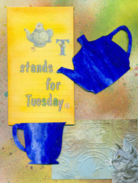
The package cried out to be cut and pasted.
I learned something new. If you cover your paper with matte medium and let it dry well, you can color over it and blend and smudge. It helps the card not to look like it has pieces of paper glued on it- more painterly.
I never know what to do with those pots of fuzzy stuff I got on sale one day. I think they look right here.
The stamp is from the Mini Images Quietfire collection. I highly recommend you add these on to your next order. You will thank me later!
This card was a mental health exercise. I was reading some escapist literature(?) and the male says to the female,
"It's what you want and that's all that matters."
Melt down  on my part. I've been in wonderful love and long term relationships and I don't think anyone ever said that to me.
So I said it to myself and wrote the words all over the card.
Try it some time. No hangover or bags under your eyes and I felt a lot better.

Questions and comments- please leave one.